
This is the elephant of all graphs. It is the graph of the decade. Actually it is the graph of the last three or four decades and it is sometimes called an elephant graph because of its shape.
It explains changes in real income across the globe between 1988 (the fall of state communism – and the Berlin Wall) and 2008 (the Global Financial Crisis – well, the rich world’s financial crisis). It was produced by the Serbian economist Branko Milanovic. For more see his great book Global Inequality: A New Approach for the Age of Globalization.
I am going to totally oversimplify this and make sweeping generalisations but Milanovic’s graph speaks to me and it speaks to me in its simplicity. Caveat lector – let the reader beware!
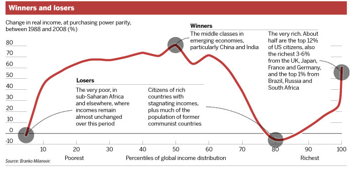
I will start on the right hand side. The developed world appears from the 80th to the 100th percentile. As has often been observed, very rich got very much richer in the 30 years from 1988 to 2008. This is what Bernie Sanders has been pointing out. The poor people and the middle class in richer countries went backwards. Look at the decline in incomes of the 80th percentile. This is what Donald Trump has been pointing out. This is the Brexit vote.
Globalisation has hammered the poor in many rich countries in part because of changing patterns of production and in part because they have been left exposed by the decisions of their governments.
Globalization has also boosted the middle class in the emerging economies. Look at the winners through the middle, say the 55th to the 75th percentile. These are mainly people in China but also in India and other parts of Asia. Trump, again, can point to China doing well and it resonates for the stagnant middle class in the United States. The same argument resonates through the North East and the British Midlands.
Then look to the far left of the graph: the very poor in Sub-Saharan Africa and the Indian subcontinent have remained very poor. People in these situations are in increasingly desperate situations. Those ravaged by war in Syrian or in penury in Africa will keep trying to move to anywhere that is better and offers some hope, no matter how dangerous the journey.
Note the first graph shows changes in income not the actual amounts. The second graph (below) shows the actual amounts income changed. About half the gains went to the top two per cent. Sixty two per cent of gains went to the top five percent. By comparison that group of “winners” in the emerging economies (from the 55th to 75th percentile) made up 25 per cent of the population and got 19 per cent of the gains overall.

If you are in the 80th percentile in global income you are a lot better off materially than people in the 50th percentile but you know you are going backwards and that you are under threat. Any wonder that you want to lash out and “take your country back”. It seems human nature that we are more likely to lash out at those threatening us from below than the rich and powerful who control the largest share of the spoils (and are often the ones pointing to the threat from the foreign hordes).